Autistica
A new digital presence for the UK’s leading autism research charity with 62% more engagement
Accessibility is at the heart of the design, allowing all audiences to engage with Autistica’s work.
What we did
- User research
- Usability testing
- Donation journey
- Website design and build
Autistica are the UK’s largest charitable funder of autism research. They have massively increased their impact over the last three years, and are growing their reach across the whole of the country.
What sets Autistica apart from other research charities is that the focus of their research is 100% directed by the members of their community, which means that they prioritise what matters most to families living with autism.
As such, Autistica identified their website as a key channel of communication that needed to be improved to better engage this community, and to make the most of their growing reputation.
They were recently named Fundraising Charity of the Year at the 2017 National Fundraising Awards and so naturally wanted to ensure their website was able to generate support for their cause and better meet the needs of their audiences – both existing and new.
In the six months since launch, the site has been even more effective in meeting their audiences’ needs than we had hoped:
52%
There are 52% more sessions on the site
62%
Content is being engaged with 62% more of the time
12%
Users are staying on the site for 12% longer
5x
Five times as many people are visiting the research project pages

We wanted to test our assumptions and build our new website accordingly. Now our content is beautifully presented, easy to understand and offers an intuitive user journey to donate or find out more.
Autistica

Given Autistica’s cause, it was essential that the new site was accessible to families and individuals affected by autism. By testing the designs and content with this community throughout the project, we ensured that their needs were being met.
All design choices in the look of the site were made with consideration for a potentially autistic audience:
- Use of a ‘humanist’ sans-serif font, which has rounded forms and a good flow to the letters. One with clear distinction between characters – for example, a double story ‘a’ to avoid confusion with an ‘o’, and a good height to the ascenders and descenders.
- Introduction of softer, more muted pale blue and yellow into the colour palette, avoiding strong, bright, contrasting colours.
- Large spacing and type sizes, and simple layout to be as easy to read as possible.
- Distracting movement or animation kept to a minimum.

By referencing the Home Office’s guidelines for ‘designing for users on the autism spectrum’ we were able to meet the needs of all audiences of the website.
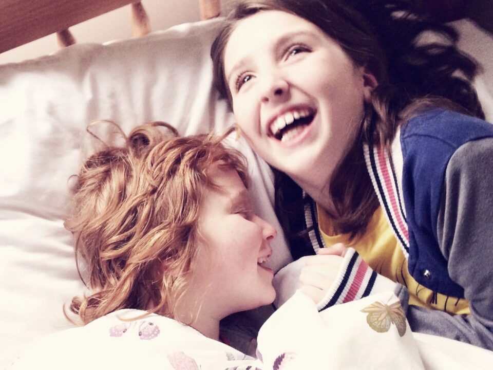

As newly commissioned photography did not fall under the scope of the project, we knew imagery would be coming from a wide range of sources. To bring consistency to the photography on the site, a series of colour treatments were applied reflecting the new palette. Content-wise, greater focus was also given to showing people together, rather than alone.


Every metric of success has improved since launch thanks to the innovative design, solid technical build and enhanced user experiences.
From fundraising conversions, to content engagement, to search discoverability, the project has been an important step forward for the charity – and one we’re proud to have been a part of.
Despite a tight deadline the team delivered exactly what we hoped for and made the entire experience a pleasure to be involved in.
Autistica