Christians Against Poverty
Ending UK poverty in partnership with local communities
Our partnership with CAP has led us both to discover new ways to create accessible, inclusive digital services.
What we did
- Content strategy
- Usability testing
- Service design
- Donation journey
- Website design and build
Since the early days of Christians Against Poverty (CAP) in 1996, there has been a passion to reach those who have been excluded because of their financial circumstances. They’ve prioritised face-to-face debt help, going the extra mile to provide the care clients have needed.
Working with local churches and food banks, they’ve offered clients emergency help, spoken to their creditors and walked alongside them as they journeyed out of debt.
They believe that everyone should be treated with dignity, live in freedom and have equal opportunities, and are constantly seeking ways to make this possible.
The website project was a crucial step forward in making their support even more inclusive.
112%
increase in conversions for service users since launch
68%
increase in user sessions since launch
93%
satisfaction rate of the new website from on-page survey
It’s important that we make it easy for everyone to access our services, rather than putting extra barriers in the way of those that need them most. William Joseph have helped us turn this into a practical reality with a much more accessible and inclusive website.
Christians Against Poverty
While it’s easy to focus on the purely technical elements of accessible website design and building, it’s also crucial to remember the more human side of things.
From testing with people who have a wide range of different needs, to designing content to speak clearly to someone in a moment of deep personal crisis, all make a more accessible and inclusive digital experience.
Looking back on the whole process, the audience research stage was the cornerstone to a successful end product. It allowed us to better understand audience behaviours and help get rid of any of our own assumptions.
Laura Thomas, Christians Against Poverty
Focusing on key user journeys
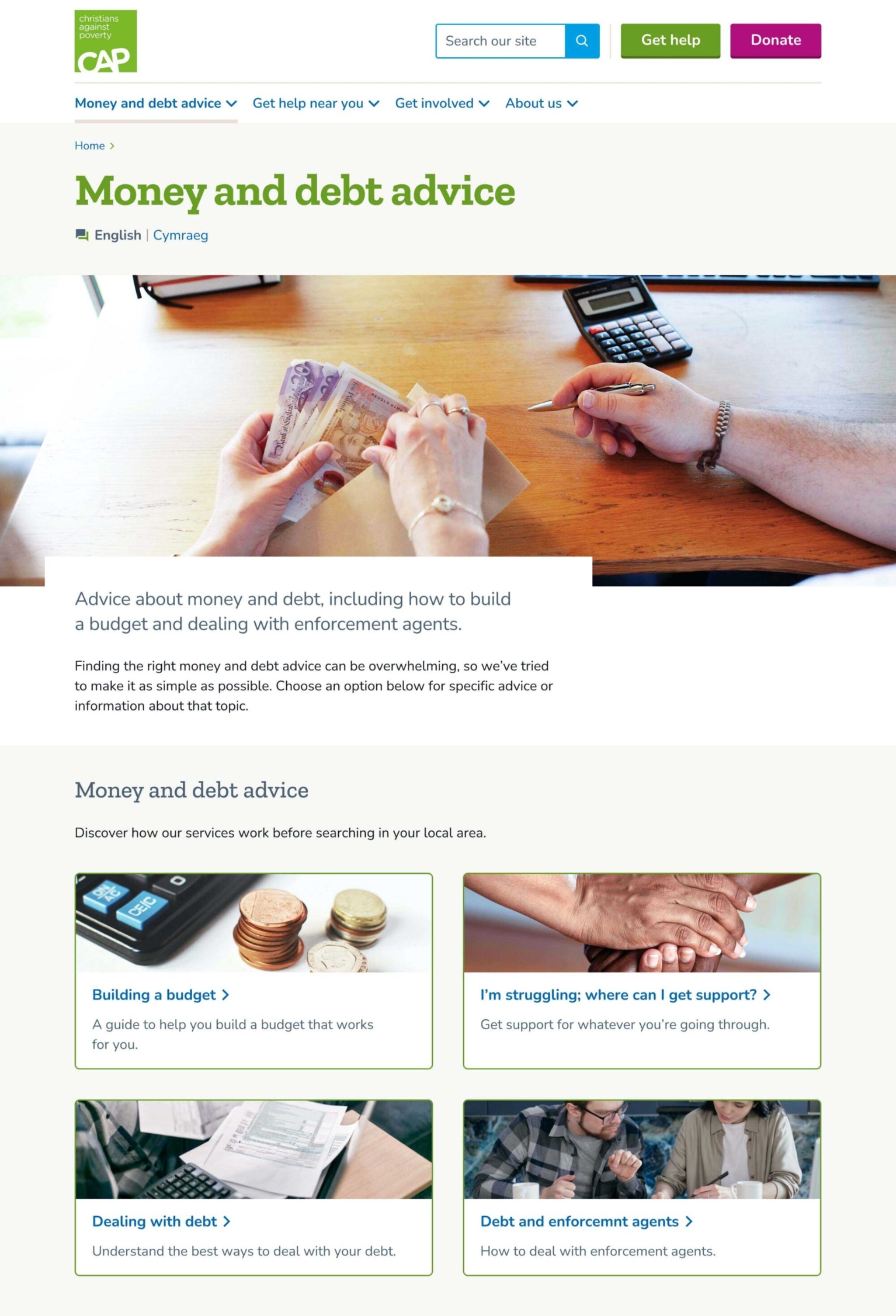
One of the main goals of the website project has been to increase the reach of the support CAP can deliver to people trying to manage their debt. To achieve this they have made bold choices prioritising those looking for help.
By highlighting the main ways to get help, more people can access CAP’s life changing services. Finding help near to people is one of the main ways to access CAP’s services.


Using plain English
The entire site is written in language that people actually use, rather than that of the organisation. Throughout the design process content was tested with people with a wide range of accessibility needs.
Moving forward, all articles on the site will use readability checkers to make sure they are as clear and concise as possible.


Built-in accessibility functions
While making a website accessible involves far more than just specific technical features, there are some that make a big difference to users.
Building in video transcripts and closed captions ensures that anyone can get the full experience of the stories that CAP tell through their video content.
CAP work with any and everyone, to reduce debt. Including built-in translation to the website means anyone is able to access this support, even if English is not their first language.


It’s really good that you’ve got the translation options – a lot of websites forget about that.
User testing participant
Ways to support that fit people’s lives
The site makes it easier than ever for people to donate time, money or other support to CAP’s cause.
Once they become a supporter it’s easier than ever for people to manage their own details, change their donation amount or update their Gift Aid details.

Accessible colours
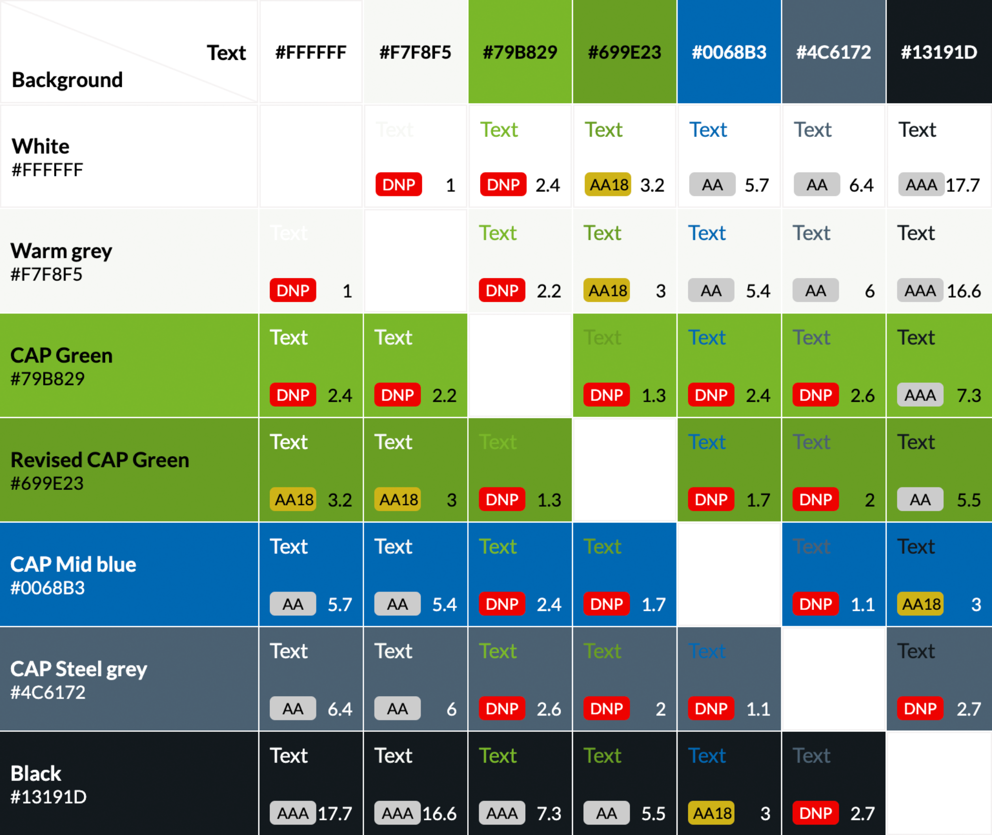
CAP’s green colour did not meet WCAG guidelines for text contrast with white. We worked with CAP to flex the brand palette and create a slightly modified green for this project, that contrasts at 3.2:1 with white and 3:1 with warm grey.
Achieving 3:1 contrast against the light colours in the palette meant we were able to use this new green for:
- text that is 24px or larger
- bold text that is 19px or larger
- essential graphics and user interface components
