Moorfields Eye Charity
An accessible website for Europe’s oldest eye hospital charity
By co-designing the website with visually impaired users, we ensured the most important goals can be achieved no matter what technologies people use.
What we did
- Content strategy
- Usability testing
- Donation journey
- Website design and build
Impact measured against UN Sustainable Development Goals
Moorfields Eye Charity wanted to enhance its digital presence so supporters, volunteers and other audiences could interact with them. This included the ability to make donations, fundraise, book events, access information and get in touch.
We worked closely with the Moorfields team to extend this brief by also providing an effective experience for anyone using assistive technology to help with a visual impairment.
William Joseph have taken the time to deeply understand our audiences’ needs and build a website that helps them all.
Robert Dufton, CEO, Moorfields Eye Charity
60%
increase in traffic to the website year on year
£312,685
raised for the emergency appeal online

Looking for the right content angle
As always, we started by working with the team at Moorfields Eye Charity to define who the most important audiences were for their website. This helped us learn more about the patients and families that Moorfields Eye Hospital supports 365 days a year.
By investigating the types of questions that people have when searching Google or talking to their friends on Facebook, we could begin to see the content opportunities for the charity. Our aim was to differentiate the new site from other sources of information.
We helped Moorfields identify the topics they could speak about which others could not. This resulted in significant investment in content that covered the latest research into eye conditions such as glaucoma, macular degeneration and corneal diseases.


Co-designing with the Moorfields audience
Testing with users is an inherent part of any modern design process. With Moorfields this was even more crucial given the complexity of many of their users’ web browsing setups.
For people with visual impairments, there are myriad problems with the way most websites are built. From poorly marked-up imagery to nested navigation to language that would confuse anybody, the time it takes to access even seemingly simple information can be significant.
One example of a frustration we discovered outside the immediate scope of the project was the process to log in to NHS public wifi. The way this is currently built means it will not work with most screen readers, increasing the time just to be able to connect to the internet.
By continually testing the website with those using assistive technology, we could see where we were getting it right and what needed improving.
We firmly believe that following best practices for accessibility improves the digital experience for all users. For readability these practices include:
- single column layout
- clear hierarchy of headings, using sub-headings to break up areas of text
- writing in short sentences and paragraphs
- using plain English
William Joseph have felt more like an extension of our team throughout the process; happy to challenge when needed but always pushing the project forward. We couldn’t be happier with the end result.
Robert Dufton, CEO, Moorfields Eye Charity
Inclusive design considerations
Pure black text against backgrounds of pure white can cause discomfort for the eye when users read text over an extended period of time, leading to eye strain.
We used a shade of slightly off-white and off-black for the main background and text colour to soften this glare. Mindful of brand consistency, these were carefully chosen to allow the black to still feel black rather than dark grey.

Contrast and colour are a vital consideration to reading. While black on white will always perform well, that is not necessarily the case for other colours.
Web Content Accessibility Guidelines (WCAG) measure contrast as the difference in perceived luminance or brightness between two colours, expressed as a ratio.
We ran a detailed comparison of all the colours in Moorfields’ brand palette to find permissible combinations. While WCAG permit a 3 to 1 ratio for text larger than 18 pixels, on this project we were looking to always achieve a minimum of 4.5 to 1 (AAA rating).
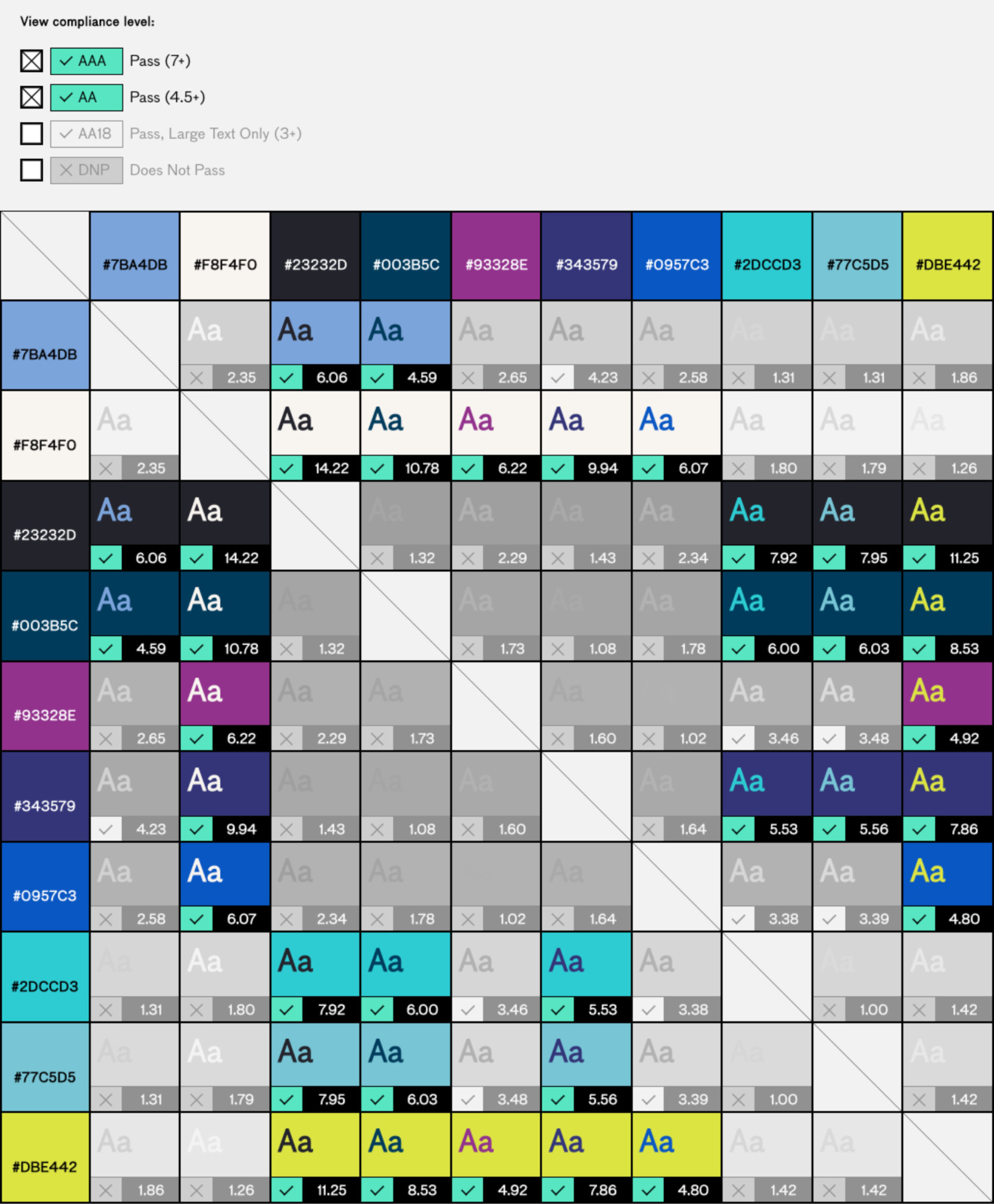
With Moorfields’ audiences in mind, we also ran the same colour comparisons through colour-blindness simulators for protanopia and deuteranopia (red-green) and tritanopia (yellow-blue).
As these would mostly affect coloured text on a coloured background, we reasoned the detrimental aspects of these conditions could largely be negated by always setting type on a white background (or ‘reversing’ white text out of a sufficiently contrasting background).


Legible typography
The Moorfields typeface Kabrio has open counters and a subtle horizontal flow that aid readability. We further improved legibility for visually-impaired users by using the alternate double-storey ‘a’ character, to reduce confusion with the letter ‘o’. We worked with the type foundry Zeta Fonts to implement this alternate character on the web.
