Great Ormond Street Hospital Charity
Improving the digital accessibility of the UK’s best loved charity
By identifying the biggest barriers to people accessing GOSH’s content products and services, we have created a more effective digital estate.
What we did
- Accessibility audit
- Insights and recommendations report
Great Ormond Street Hospital is a world famous British institution that helps thousands of children every year at their site in London. They also fund life changing research into the most devastating children’s diseases imaginable.
They approached us as they suspected that their website was not as accessible to their audiences as they would have liked. This meant that the number of people who could engage with their fundraising content and access their life changing services was reduced every single day.
Because of that we conducted a simple, but effective process to find out the digital developments which would have the maximum impact for the most efficient investment.
About 15% of the world’s population lives with some form of disability, of whom 2% to 4% experience significant difficulties in functioning.
World Health Organisation
The process started by testing content on the website with adults from across the UK, representing a diverse audience. This included people with a mix of disabilities, chronic illness and neurodiversity, which impact the way they experience websites.
Next we conducted an expert review that spanned a wide range of technical aspects across design, development and content strategy. This review included 56 different criteria with 19 passes, 20 advisories and 17 failures.
The criteria are a blend of the W3C accessibility standards and our own experience of designing inclusive digital products. This allows us to go far beyond simply ‘complying’ with AA or AAA ratings and create services which are usable in the real world.
These items have been brought together in a roadmap that is being implemented by the GOSH team to create a more inclusive suite of digital products.


Sub-navigation confusion
Users often found the donate sub-navigation overwhelming and confusing. There are also issues with the contrast level of the menu items. These will be updated to meet the W3C’s recommended 4.5:1 contrast ratio.

Donation widget clutter
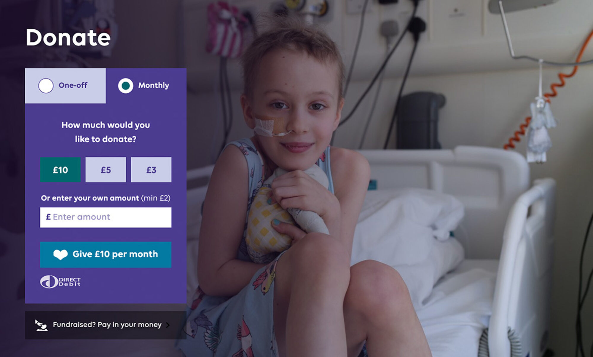
Users had various confusions around the donation widget. At times, it wasn’t clear what they needed to click to start their donation. Also, once they reached the donation form, it also wasn’t obvious how donations are spent; they had to scroll/look harder for that content.
To address this concern, GOSH are now exploring a simplified version of the donation widget to:
reduce the amount of visual clutter in the widget such as icons, logos and paying in fundraising button
create more visual consistency between predefined and manual amounts
refine language and look of submit button
consider the placement of how money is spent

I’m not clear what the heart donate button is for? Is it the same as the £10 option?
Usability testing participant
Donation form error messaging
Errors are not obvious on submission. Users sometimes assumed the page had been submitted and were not able to easily identify and rectify the errors.
The next version of the form will include an error summary at the top of a page to summarise any mistakes a user has made, including linking from the error summary to each answer.
It will also review the position, colour and styling of the error messages relative to the fields. For example:
move errors on the desktop site above the text input field rather than to the right
indicate errors with an icon rather than colour alone

Donation form clarity
The borders of form fields were not as clear as they could be for people with low vision. These can be improved by increasing the border width of text inputs across the website, particularly when the input and page backgrounds are the same colour.

The outlines of the [form] fields are not clear to me, they need to be bolder.
Usability testing participant
Alternative text consistency
The proper implementation of alternate (alt) text is key for people with low vision when using websites. Without the proper set up, screen readers can get caught up reading out pointless information, resulting in frustration and drop off from the website.
How to write effective alt text is a skill that needs to be learnt and practised. The W3C alt decision tree is a great starting point to find out more.
Event filters
The filters are widely used and the UX could be improved. When filters were selected, it wasn’t obvious that the list of events had been updated. Ideally, there should be a visual signifier to users that filters are applied to the events list (and other areas of the site where filters are used).
