King’s College London
Advancing treatment for men in substance misuse programmes who abuse their partners
In the UK, 30% of women have experienced intimate partner abuse.
What we did
- Component library design
- Digital avatar design
Impact measured against UN Sustainable Development Goals
Substance use is a known risk factor for intimate partner violence (IPV), yet most perpetrator interventions do not address substance use. This research brings key stakeholders together from both the domestic violence and substance use sectors to develop an evidence-based intervention to address both substance use and IPV.
The social and economic cost for victims of domestic abuse in year ending March 2017 in England and Wales was estimated at £66bn. Reducing intimate partner abuse and improving survivors’ mental health is a public health priority.
Substance use is associated with abuse perpetration. Men in substance use treatment are more likely to perpetrate abuse than men in the general population. Despite this, there is a lack of knowledge about how best to address abuse perpetration by men in substance use treatment and a lack of available interventions.
The ADVANCE-D programme looks to reduce this rate through a series of extensive in-person and digital interventions.
Everyone at William Joseph has been fantastic! They were very responsive and excellent at making technical issues accessible to a non-specialist audience. They modernised the design of our ADVANCE-D intervention website sessions and it looks great.
Professor Gail Gilchrist, King’s College London
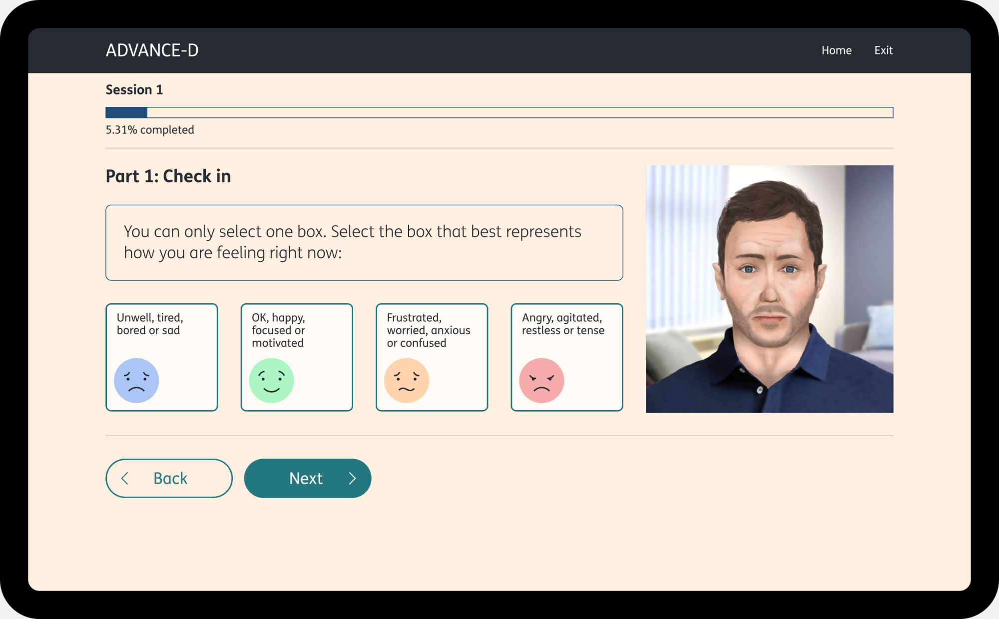
Creating empathy through realistic digital avatars
The previous version of the ADVANCE-D programme featured a single flat, illustrated avatar. Through extensive testing, the team identified that the information being given by these figures was not engaging people throughout the programme.

The ambition was to create more of a connection between the people using the content and the avatar by developing the avatars to feature a range of different, more realistic faces.
The avatars were carefully co-designed with the audience of the service to feel welcoming but authoritative, as a therapist would.
It would be better to actually see a face… a person talking rather than just a silhouette. Make it more personal.
User of the previous build
Simplifying the user experience to be more accessible
Many of the people using this system are dyslexic and accessing the content in a difficult and stressful time. The design of the user experience can significantly improve their ability to engage with the content and ultimately progress through the course. We took several steps to create a more accessible user experience, including:
1. Avoiding looking like the government or NHS sites
A concern that came out of the discovery work was around the new site design not looking like it is provided by the NHS or government due to user mistrust. To avoid this we made some broad design choices from the outset to help negate this:
- Use of off-white or non-white page backgrounds
- Avoiding default ‘browser’ blue for links and interactions
2. Colour
The colour palette has high enough contrast for legibility, meeting WCAG contrast guidelines, while also having a muted feel. To reduce glare, neither pure black or white is used in the design.

3. Typography
The font family chosen for the site – FS Me – was designed by Fontsmith and developed with Mencap to improve legibility for people with learning disabilities.


4. More accessible interactions
There is a significant amount of interaction and engagement throughout the content, with hundreds of questions put to users. We audited the existing patterns being used on the service to see what refinements could be made.
For example, when there is a short list of options, radio buttons work better than dropdown selects as users can compare the options at a glance and answering involves less clicks.


