Trees for Cities
Growing this tree-planting charity’s mission, without forgetting their roots
Relaunching a world-leading charity brand with a handcrafted identity
What we did
- Brand strategy
- Logo design
- Visual identity
- Brand guidelines
- Content strategy
- Website design and build
- Typeface design
Trees for Cities are the only UK charity improving lives by creating greener cities around the world. Their dedicated volunteers get stuck in with local communities to cultivate lasting change in their neighbourhoods – whether it’s revitalising forgotten spaces, creating healthier environments or growing food with kids.
The charity started life as Trees for London around 30 years ago, bringing nature to the urban environment through their innovative tree planting raves. Since then they’ve grown but felt they had lost a bit of their personality along the way.
The brief to us was to refocus and reinvigorate the way they perceived their own work and were presented to the rest of the world. We worked with Trees for Cities’ trustees to redefine the way they talk about their work and reposition the organisation with a confident, bold and inclusive new identity which represented the passion of their supporters.
Impact
Once this identity was applied to a renewed website, the results were significant. Year on year the new site has seen:
59%
59% fewer people are leaving the site without engaging with any content
55%
There are 55% more first-time users to the website
15%
Each visitor is spending 15% more time on the site
Following initial market research and stakeholder workshops, we repositioned the way Trees for Cities talk about themselves with a new strapline, mission statement and tone of voice guidelines; shifting their messaging to focus on the lasting impact they have while retaining the character of their organisation as being hands-on and inclusive.

Early visual explorations clarified that while trees are indeed the vehicle for change, the core positioning is actually about people; community, education, well-being. Aligned to this insight, a hand crafted route was created and developed.

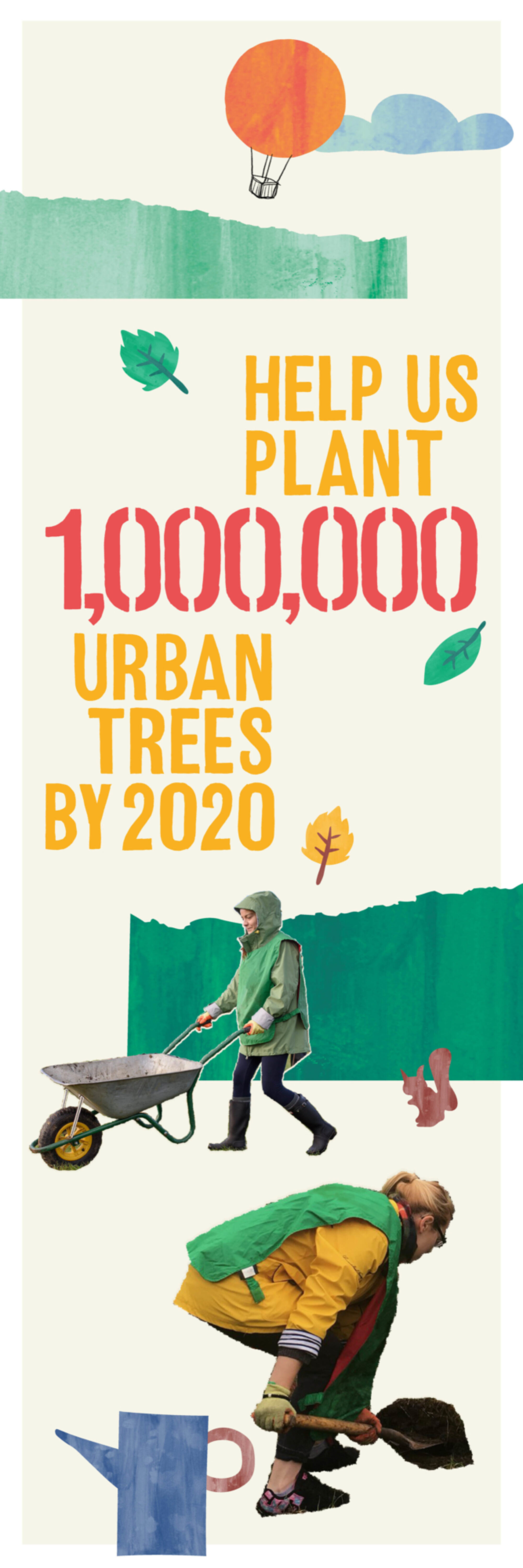
A hand-drawn typeface was created in both stencil and solid weights which was then digitised and used as the basis of the visual identity. The urban feel serves to anchor the whole identity in an ownable, bespoke asset that Trees for Cities can use freely across all their materials.
The new logo uses the typeface, and reinforces the idea of people and community being strengthened by the environmental work of the charity.


Trees for Cities asked us to roll-out the brand across a new digital presence. The aim was to better showcase the work they do with the impact they have. We created a number of elements to work across the site, allowing easily scalable content types with reusable modules. We focused on statistics, bringing these out in the new font to be used in different ways on each of their templates.


Despite our humble beginnings, Trees for Cities has real impact in the neighbourhoods in which we operate. Parks, streets, schools and housing estates across the UK are all healthier communities thanks to the work of our volunteers. We now have a brand which truly reflects this impact and we couldn’t be happier with the results.
David Elliot, CEO, Trees for Cities