The Health Foundation
Transforming digital connection with the Q community
We reimagined the Q community platform for equity and accessibility
What we did
- Content strategy
- Usability testing
- Website design and build
Impact measured against UN Sustainable Development Goals
The Q community is a long-term Health Foundation initiative to support individuals in fostering continuous and sustainable improvement in health and care. The previous digital community was set up a long time ago and has grown in an organic way which was becoming harder and harder to manage.
The project aimed to rebuild the entire membership experience from scratch to be in line with the community’s needs. We partnered with the Q community team to run a collaborative, user-centred process which created an inclusive, sector-leading digital product.
This project was delivered in partnership with Emma Parnell and Mel Ezechukwu.
Equity by co-design
The strength of the Q community is the diversity of perspectives that it brings together. From people working in small trusts in rural Scotland to those leading integrated care teams across the country, everybody learns from and supports each other.
The aim of the new digital platform is to create more opportunities to connect while reducing the barriers for a diverse group of people to come together. Emma Parnell started this process looking at the registration journey into the community. Mel Ezechukwu continued it by prioritising a wide range of requirements that had been gathered by the Health Foundation teams and stakeholders.
We then recruited a diverse group of members to inform every aspect of the strategy and design of the platform. These people came together repeatedly through the project, both in person and remotely. Their work was crucial in creating a product that worked for everyone that makes up the Q community.


Accessible design and content
In 2022, we worked with the Health Foundation to create the Q community brand identity. The identity was designed to make sense to a wide range of people, and has at its heart a digital look and feel that is easy to understand and use, no matter what needs somebody comes to the organisation with.
Through this project we developed this brand into a full pattern library for the website and community platform. Using bespoke standards that build on the WCAG framework, we ensured that user needs would be at the heart of the design, while still creating a sense of vibrancy in the community.

This extended to the content strategy of the platform. Naturally there is complexity to much of the work of Q – if there wasn’t then it would be easy! However, by working with the co-design group we created a suite of resources that a wide range of people can understand. This top-level content progressively reveals detail for those that need to get into more specifics.
It’s welcoming, not too busy, but still feels health related. The site is slightly reminiscent of GOV.UK – the clean, simple aesthetic, clicking on cards etc. It’s easy to navigate.
Q community member
Complex data to allow simple journeys for members
The main website and community platform are built across two different systems: Craft CMS and Higher Logic. The Health Foundation’s community member data is in Salesforce and remains the system of record for all users of the platform.
Obviously members don’t care which technology sits behind the website, they just want it to be simple to sign in to and engage with people. We created secure integrations between the three systems to ensure that a member can log in seamlessly using their credentials.

With Higher Logic being an off-the-shelf product, there was a lot of customisation involved to ensure that members’ journeys made sense between the website and platform. With subtle design touches through the navigation we indicated to people exactly where they are in the journey.
There was extensive work to migrate users from the old platform to the new one, including a full data transfer strategy plus a communication plan to bring people over in waves. Throughout the site, there is information for anyone looking to understand more about the migration process.
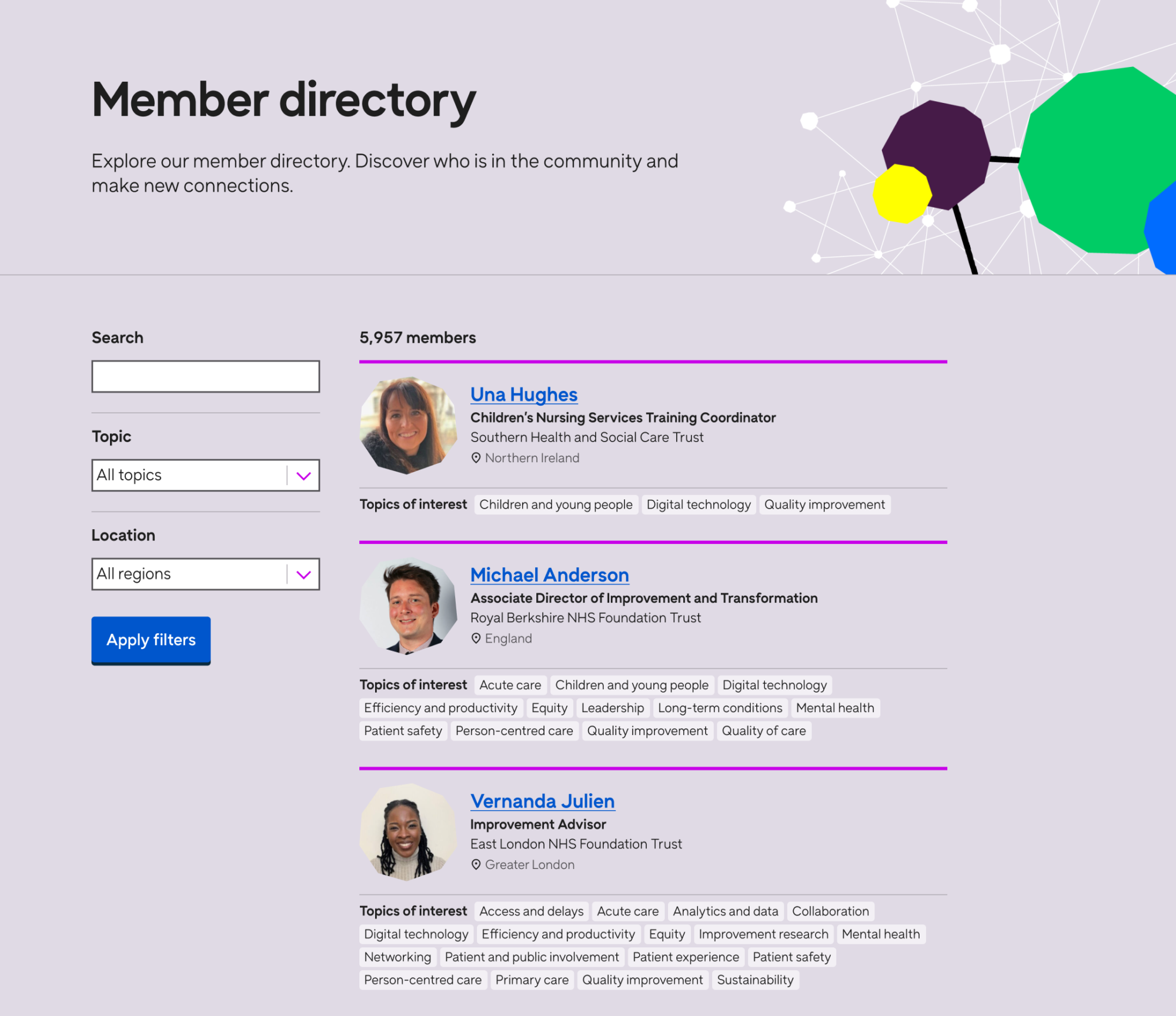
The member directory is useful. It’s about finding like-minded people, sharing resources, bouncing ideas off each other.
Q community member
The membership directory was a key feature of the platform helping people to find fellow practitioners working in a similar area as them.
Generally if I’m going somewhere it’s the resources I’m looking at first – I need something practical. I need to know if they are useful to me.
Q community member
An iterative design and build process to maximise value to members
Given the complexity of the final product, usability testing was crucial throughout the design and build process. This started by testing wireframes with the co-design group across the content and membership experience.
We then created high fidelity designs that were tested by members and we iterated based on their feedback.

Once the build was completed, an extensive user acceptance testing process was employed to ensure that the platform was working as expected for both members and the Health Foundation team who manage the community.